Petfood packaging and branding seems to be getting picked on in the blogosphere lately. Earlier this week, a former industry colleague forwarded an e-newsletter highlighting a blog post with this headline: “Opportunity in a stale category: petfood could be a lot peppier.”
This comes on the heels of a blog post shared by my current colleague, Jessica Taylor, on the LinkedIn Petfood Industry Community group that begins with this statement: “A market that has a serious sense of humor failure, where even dogs want good packaging design and a smile.”
Stale? Sense of humor failure? Wow, seems like our industry really needs to lighten up!
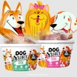
The blog from last week appeared on the World Packaging Design Society website and showcased an innovative – and yes, fun – new dog treat package by Cecelia Uhr, a designer based in Toronto, Ontario, Canada. “If you happen to have a dog, you may have noticed that there isn’t much variety when it comes to dog food and snacks package design,” she wrote.
For a rawhide-type chew called Whitebites that comes in three sizes, Uhr and her team designed a line of packaging featuring three different dog breed illustrations to correspond with the size of dog each size of chew is intended for. The mouth of each illustration is cut out to show the product, which is lined up to look like teeth within the mouth. Further cleverness comes from the ears of the illustrated dogs: The left ear serves as a flap from which to dispense the chews, while the right ear has a hole from which to hang the package on a display rack.
(Note: It is unclear if these dog chews are actually on the market; Jakks Pacific offers a White Bites oral care dog treat featuring Arm and Hammer baking soda, but they are not chews.)
The blog post pleading for peppiness in the petfood market comes from the Hartman Group, a consumer research firm based in Bellevue, Washington, USA. The actual post on the website is entitled, in part, “Pets are people, too.” I beg to differ (despite our industry’s reliance on humanization of pets), and that’s not the only assertion that seems off base.
I don’t disagree with the main premise of the post, which is that petfood, particularly the natural category, has become very “me too” in its packaging and branding. Or, as the Hartman Group puts it, “as big as this marketplace is, it is shocking how homogeneous its contenders are.”
Yet, while the firm says it has been advising consumer goods brands since 1989, several statements on this blog seem to indicate a lack of in-depth knowledge about the natural petfood category. For example, the post lists specific elements common to the category’s packaging that apparently are now passé, such as “formula,” “nutrition” or “balance” labels on front packaging and the “prominent use of ingredient decks and nutrition claims” on the front of packages. “Why step backward when it comes to pets?” the blog says.
Well, perhaps it’s not so backward considering that recent research shows petfood purchasers respond to such elements on a label. In a Fall 2013 study of 545 US pet owners recruited to ensure that they represent the entire country, own at least one dog or cat and do most of the petfood shopping in their households, 54% rated ingredient claims as credible or highly credible and 65% rated the claim of "complete and balanced nutrition" as credible or highly credible.
The study, conducted by Shikitani LaCroix, a design agency based in Toronto, also showed that petfood purchasers perceived higher credibility from detailed information on petfood packaging, and the highest level of credibility came from a combination of imagery and at ingredient claims. (Use of photographic imagery on petfood packages is another no-no, according to the Hartman Group.)
The Hartman blog gave examples of petfood products and packages it believes break out of the homogenous mold, and while I, too, find these attractive, I don’t consider them all that innovative – not nearly as much as the Uhr design for the dog chews packages. No offense to either company mentioned on the Hartman blog; it’s just that, if the author looked a little more diligently, he or she would find many other instances similar to the examples lauded. I suppose one person’s idea of innovation is another’s same old, same old.
What do you think: Is an injection of humor and fun the answer to petfood packaging and branding’s lack of innovation?


