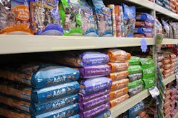
Maintaining an innovative edge is a lot more complicated than it used to be, especially when it comes to pet food packaging. After all, technology only reaches so far, the styles popular with customers come and go in waves, and limited shelf space bursting with options makes it more difficult than ever to get your product in front of your audience for more than a second or two — if you’re lucky. But of course no one wants to feel stale, or worse yet, look at their packaging one day and realize they’ve missed the latest wave and been left behind.
With all that in mind, below are three case studies highlighting new packaging that has come out in 2018. Each company had a different starting point and a different vision, and in the end they played to their strengths and took a few chances to come up with the best vision for their products and their brands.
Jones Natural Chews
Product: Jones Select dog treats
Focus: Standing out on superpremium pet product shelves with a new product line.
Jones Natural Chews has a pretty distinctive “look.” A bright cartoon dog, Rocky, leaps from the company’s packaging, which also features a gold and bold pink color scheme. Together, the brand gives off a fun, happy vibe that Jones customers can easily spot on store shelves. But for the company’s new superpremum treat line, Jones Select, President and CEO Joe Wallington wanted another look entirely.
“What we purposely tried to do with Jones Select is downplay Rocky and that color,” said Wallington. “On the regular Jones chews we think that the packaging color is great; it’s bright, it’s fun, it’s treats. But typically, the premium treats buyer is more focused on the nutritional aspect of the product, so we wanted it to look very upscale. We didn’t think Rocky and his fun character were synonymous with that upscale idea.”
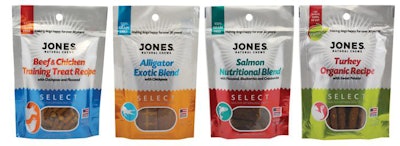
The new Jones Select product line displays a significant departure from the company’s traditional bright, fun packaging complete with Rocky the dog. | Photo courtesy Jones Natural Chews
Wallington decided to downplay Rocky, placing him in grayscale on the back of the Jones Select packaging. The front of the packaging was reserved for the primary protein used and any other relevant marketing (alligator meat and grain free, for example).
“If you had one second to look at the package, we wanted the ingredient to really pop out,” said Wallington. “We wanted it to look bold and yet not too in-your-face, just rich looking. So we used Metalure ink on everything we wanted to pop out.” And since the company was expanding into a new market segment where people might not know the Jones brand, and if they did were used to seeing a bright yellow dog, a new packaging slogan was born to ensure customers of Jones’ relevance: “Making dogs happy for over 30 years.”
The risk of coming up with packaging that looks completely different from other Jones products has paid off, according to Wallington.
“We already won one packaging award and we’ve had phenomenal feedback from our customers,” said Wallington. “They think it looks rich, they think it stands out from the other packaging on the shelf. We started shipping Jones Select in mid-April, and we are already planning on expanding the line. I think it’s going to be a huge win for us.”
Petcurean
Product: Now Fresh stews for dogs and pâtés for cats
Focus: Sustainability in product packaging at all process levels.
When Petcurean decided to expand their Now Fresh line to include wet food, they realized there was an opportunity to be had in the area of sustainability, a hot topic in the pet food industry right now as well as a cause important to the company. They decided to look at several options that provided different pros and cons, and settled on one that combined environmentalism and convenience: Tetra Pak cartons.
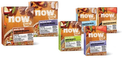
Petcurean looked to Tetra Pak for sustainable packaging to suit its new line of stews for dogs and pâtés for cats. | Photo courtesy of Petcurean
“This is new and exciting for us,” said Annabelle Immega, trade marketing manager for Petcurean. “They’re made with 65 percent renewable materials and FSC (Forest Stewardship Council) certified paperboard, and they are recyclable at home. They’re also very, very convenient. It’s super simple, no equipment needed. Just pop open the corners and it has a serrated edge at the top that you tear off. Once the packaging opens up, you just pop it closed again and stick leftovers in your fridge.”
Beyond being recyclable, the packaging serves to further sustainability goals at other points in the overall pet food manufacturing process.
“They ship flat and super light, so you’re saving money on shipping and fuel costs,” said Immega. “All those little factors add up to be very sustainable. They also stack very well, so they use up about 40 percent less shelf space than cans do, which is really great for retailers. And they look really nice; they stand out. It’s something a little bit different.”
Petcurean is a gold member of the Pet Sustainability Coalition, which means the company is constantly looking for ways to improve every step of their production process with sustainability in mind. The company’s Gather line is “really our shining pinnacle of what sustainability looks like from a product standpoint,” said Immega. “Our packaging is made with 30 percent plant-based materials; it’s plastic made with sugarcane. Sugarcane is a very sustainable crop; it doesn’t take much water and it grows very quickly.
“The organic certification of ingredients in Gather encompasses a sustainable farming practice, and it also encompasses the humane treatment of animals,” she said. “From a larger business standpoint, we’re constantly looking to do that sort of thing, pushing our suppliers to work with us to get to as much of a sustainable business practice as possible.”
Sojos
Product: Sojos Complete formulas for dogs
Focus: Branding and company messaging.
Sojos has recently relocated to a new facility called Farm Fresh Kitchens, located in St. Paul, Minnesota, USA. The move caused the company to rethink their “Made in USA” marketing and focus on finding a way to really highlight where exactly Sojos food comes from.
“We introduced redesigned packaging,” said Kira Garrett, marketing and PR specialist for Sojos. “We are placing a much greater emphasis on the fact that we’re made in Minnesota. We really want to talk about our roots and talk about the fact that we’re made in Minnesota, with this cool icon on the front that is going to be on every package moving forward. Instead of doing “Made in USA,” we’re really focusing on “Made in Minnesota.”
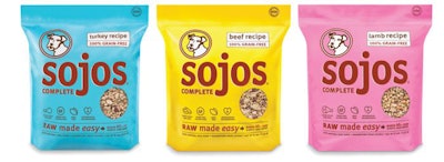
Sojos made several changes to their packaging to convey the company’s brand message and highlight their accessibility to customers. | Photo courtesy of Sojos
In addition, the Farm Fresh Kitchens logo has been added to all the company’s packaging, reiterating that the products are all made in a Sojos facility and that the company does everything under its own roof.
While they were at it, Sojos aimed for a visual refresh on their Complete line of dog foods.
“We added a polka dot motif, which I think helps distinguish among all our product lines,” said Garrett. “The Mix and Meal line has the checker board across the top and all of our Complete recipes will have the polka dot. Wild is slightly different, because it’s a totally different product. So I think [the redesign] makes it a little bit easier for consumers to distinguish on the shelf really quickly, ‘Oh, I know what line this product is from,’ just based on the pattern on the bags.”
Sojos also moved the clear window on their packaging to the side panel to provide more visual real estate for the product inside the bag.
“Before it was on the front of the package; this way we were able to make it a lot bigger,” said Garrett. “This is good, because we try to use really big, whole chunks of food, so having a much larger window really showcases that.”
Overall, Sojos was going for an approachable, fun look that reiterated the company’s strengths.
“Sometimes pet nutrition can be kind of stressful,” said Garrett. “There’s so much research you have to do, and sometimes products themselves can be complicated. We’ve always been about making it as easy as possible to feed our food, and we try not to take ourselves too seriously. We love to do bright colors and polka dots. It’s all about the relationship you have with your pet, and about the joy you get from having a pet in your life and as part of your family. So why not have a product that reflects that?”
Expert opinion: Pet food packaging trends in 2018

