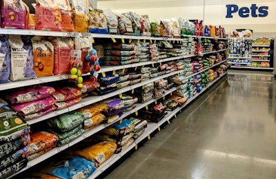
Companies update packaging for many reasons, but one of the big motivations these days involves a strong consumer focus and an eye toward what that consumer has to wade through on pet food shelves. Here, we take a look at four brands with recently redesigned packaging that, through both marketing and structural changes, aims to simplify customer choice and clarify brand strengths regarding current pet food trends.
Gott Pet Products: Charlee Bear, Hound & Gatos redesigns
Gott Pet Products’ Charlee Bear line of treats has gotten a new look that the company calls “energetic” and focuses on appealing to existing customers as well as the newer generations.

Treat products are more often casual, impulse purchases, so the packaging can be more playful and whimsical — something Gott kept in mind during the Charlee Bear redesign. | Courtesy Gott Pet Products
“We’re confident about these revitalized package designs because they were based on extensive consumer focus group testing prior to launch,” said Patrick McGarry, chief operating officer of Gott. “We are aware of the growing number of pet parents among millennials and Gen Xers but felt it was important that we continue to appeal to our current customers. You could say that our new packages are already female-approved across all generations. We now offer four complete lines of Charlee Bear treats that dogs everywhere are loving.”
Gott wanted to create designs with a cohesive look that tied the different treat lines together, according to McGarry.
“It was also important to create a look that would stand out on shelves and attract a new generation of pet parents, while still appealing to our current and loyal customers. We debuted our new pouches in vibrant colors to stake out our place on the shelf and made the star of the packages our iconic Charlee Bear dog. We also came up with a compelling slogan to differentiate our brand from all the rest — ‘Beary Tasty Treats!’”
Gott’s newly acquired Hound & Gatos brand also has an updated look, including a new logo that is “appropriate for a strong, dependable brand,” according to McGarry.

During the redesign, it was important for Hound & Gatos to convey that none of the wet formulas had changed, even though the packaging was new. | Courtesy Gott Pet Products
“The new look of these labels was inspired by real life,” he said. “Pet parents know how incredibly excited their pets can get when they encounter real meat. That’s why highly appetizing images of grilled meat, fish and poultry play such a prominent role on every package.”
Gott also wanted potential customers to know what category the Hound & Gatos line stands up against, while reassuring existing customers of the brand’s staying power.
“We wanted busy shoppers to know that Hound & Gatos was a serious superpremium contender when they were considering switching dog or cat food brands,” said McGarry. “We also felt it was important to reassure retailers and pet owners that despite our package revamp, no changes have been made to our wet formulas.”
Purina: Pro Plan packaging redesign
Nestlé Purina PetCare Company’s Purina Pro Plan formulas have undergone a packaging revamp that focuses on readability and simplicity for consumers, according to Emily Goldkamp, marketing public relations for the company.
[pro-plan-dog-old-new-packaging]
Pro Plan now sports a simpler design that Purina hopes will make it easier for pet owners to find the formula they need for their animal. | Courtesy Nestlé Purina PetCare Company
“In 2020 we’re making some exciting changes to our packaging, which will be available on the shelf in August,” she said. Among the changes are a streamlined new look to help pet owners find their formula, the addition of a seal indicating that the formulas are fortified with probiotics for digestive and immune health (Pro Plan dry dog and cat formulas) and a reorganization of formulas by life stage and unique needs to help pet owners find exactly what they need for their pet.
In addition to those key attributes, the new designs make it easier to find the desired primary protein and kibble texture, as well as any additional benefits each formula may provide.
Vitakraft: Vita Prima packaging and formula updates
Vitakraft Sun Seed Inc. has refreshed its flagship Vita Prima diet line with all-new graphics, a change in packaging style and improved formulations, according to the company.
“Vita Prima first launched in 2010 and only had a minor graphics update a few years later, so nearing a decade old, the packaging was really overdue for a redesign,” said Julie Fain, product development and marketing coordinator for the company. “But as our flagship line with 21 products to update at once, we knew this wasn’t a project we could rush. From start to finish, it took us a year to finally see the new packaging on store shelves.”
The company did consumer research to better understand how small animal and bird owners felt about certain packaging features.
“That research really shaped the framework of our new design and told us which features weren’t all that helpful and which ones we needed to include, such as a window on the front panel and good photos of real animals and fresh ingredients instead of illustrated images,” said Fain. “We also decided to go back to the box-bottom style packaging that Vita Prima originally came in 10 years ago, with a lighter color palette and matte finish. We felt this would greatly improve shelf-presence and help the products stand out better.”
The new formulas and designs hit shelves in October 2019, and consumer reception over the last six months has been positive, according to Fain.
“The response we’ve heard from consumers has been good,” she said. “They love the new updated graphics and are generally pleased with the recipe changes made to remove the colorants and other additives that aren’t necessary in their pet’s food. And of course, we’re very pleased with how our redesigned Vita Prima line has turned out too!”