With current shifts in customer priorities, a lot of pet food companies are taking a good look at their packaging. From eco-consciousness to telling a cohesive brand story, packaging provides multiple opportunities to touch on major trends and optimize interactions with pet owners.
The two below companies had very different goals, but both required significant overhauls of their product packaging to achieve the results they wanted. Let’s take a look at their process:
Bella & Duke: Reducing costs and their carbon footprint
Bella & Duke is a direct-to-consumer (DTC) pet food subscription company based in the UK. The company, founded in 2017, offers raw formulas for dogs and cats, as well as dog treats and supplements. As business has grown and trends have shifted in the last several years, Co-founders Tony Ottley and Mark Scott decided it was time to make a change to their product packaging, which comprised a dense, plastic ice cream-style tub that had a self-adhesive top label with limited printing area.


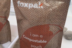
Bella & Duke opted for more marketing real estate and less plastic in their packaging redesign, resulting in significant savings for the company as well a lighter carbon footprint. | Courtesy Bella & Duke
“The self-adhesive top label would only allow for print on the face of the label,” said UK-based packaging company Ravenwood Packaging. “[Ottley and Scott] wanted the option for an increased surface print area but with the underside of the label stuck to the pack, space was limited.”
The solution was making the move to a c-wrap linerless label, which features double the surface print area with both the face and underside free for print. The company intends to use the extra space for adding additional product information, including nutritional facts, healthcare advice, marketing mechanics and promotions.
As a bonus, the linerless labels checked off another significant box for Bella & Duke: They don’t feature label liner, which means the need to landfill, incinerate or recycle the backing paper is completely eradicated.
“From my point of view it’s the general desire and direction of travel to reduce the impact and influence of plastic elements within packaging,” said Kev Dudman, packaging innovations specialist for UK-based Reflex Labels, which offers end-to-end packaging solutions and also worked with Bella & Duke on their packaging updates. “The challenge of replacing functional plastics remains one of the key drivers in packaging innovation into other substrates such as fiber based or recycled content materials, while moving to a recyclable format for consumer convenience and environmental considerations. As the UK packaging strategy for collection and recycle infrastructure of post-consumer waste (PCW) materials increases, today’s packaging trends need to be as future-proof as possible to meet these requirements.”
Reducing plastic is what led to the other big packaging change for Bella & Duke: Switching from the ice cream-style tubs to thermoform trays.
“Minimizing their environmental impact was very much a factor in their packaging redesign decision,” said Gary Frost, Reflex account manager for Bella & Duke. “In fact, probably the easiest option for them would have been to turn to plastic, but they were adamant that they wanted a board solution that could be recycled.”
Changing the tray format alone has resulted in a 38% reduction in plastic packaging, according to Ravenwood Packaging, as well as a 98% reduction in Bella & Duke’s packaging shipping costs.
Natural Balance Pet Foods: A new brand story with packaging to match
When Natural Balance was acquired from J.M. Smucker Co. by Nexus Capital Management LP in February 2021, the new leadership team knew it was time for a serious brand update.


“We took a step back and said, what do we want to look like now as a new brand?” said CEO Brian Connolly. “Because it’s a complete reboot; it’s basically been the same packaging in the marketplace throughout Natural Balance’s 30-year history, and it’s served them well but we felt it was time to refresh and enhance. We went way more ingredient-centric.”
Part of the ingredient-first theme involved an overhaul of the logo, which took up significant real estate in the original packaging.
“In rebranding the logo, we still pay homage to the mountains and have those in the background,” said Connolly. “And the other thing we took a position on was, previously the packaging all referenced Dick Van Patten, who was the founder of the business. He was a sitcom actor, but we felt it was probably only baby boomers who remembered him, so we dropped Dick Van Patten’s possessive of the Natural Balance brand to focus on clean label and the mountains.”
Communication with customers, both old and new, was a key concern of the team as they rebranded and changed the packaging.
“Obviously we wanted to be mindful of not confusing the consumer,” said Connelly. They maintained the color scheme of the proteins and made sure the logo, while smaller, still held center place at the top of the bags. They then got to work on telling their story. Beyond the large ingredient images on the bags, Natural Balance wanted to more prominently promote its “Feed with Confidence” guarantee as well as the nutritional benefits of the formulas.
“We felt our consumers want to know what’s in the package,” said Connelly. “That’s why we focused on the ingredients primarily. Secondly, [they want to know] that it’s a safe product to feed — that’s where the Feed with Confidence logo comes in. And thirdly, [they want to know] what are the nutritional benefits, and those are the six icons on the back of the bag. We’re trying to be transparent, communicate as much as we possibly can with pet owners so they know exactly what they’re getting and what they’re feeding their animal.”
Overall, Natural Balance wants to tell a simple story involving quality ingredients and delicious food for pets.
“As a pet parent you want to make the right choices for your pet,” said Lara Bernhardt, retention marketing manager for Natural Balance. “And when you’re standing in the aisle it can feel very complicated. So that’s the other subtext of our marketing campaign: We’re trying to uncomplicate the complicated and help with the bag’s telling an ingredient story with the ingredients and the benefits. That’s what we hope to accomplish.”
For the latest on pet food packaging and labeling trends